
Follow me, dear readers, into the murky world of statistics. Not that I wish to take you far, but far enough – with any luck – to tickle your curiosity. Let me begin.
Here is a graph showing the incidence of the virus in the UK over recent days:
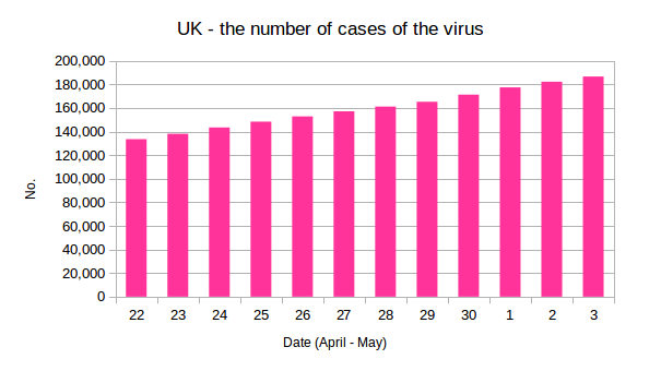
you will note that the bars rise from left to right in something approaching a straight line. There is no obvious levelling off.
Here is another, showing the same data for the same days reported from France:
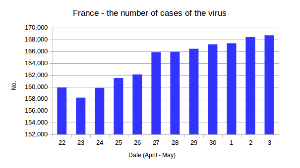
this time the picture is a little more complex: the line of ascent is less uniform, but from, say 27th April on there does appear to have been some “flattening of the curve.” Now, here is the same graph again, to which I have added the number of (French) deaths:
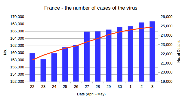
Once again, there is some levelling off towards the right. So now let us try to add figures for deaths to the UK chart:
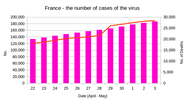
It does appear that the number of deaths caused by the virus in the UK is beginning to flatten, although it is worth noting that at just under 30,000 it is now considerably higher than the equivalent figure for France (which remains under 25,000) and that conclusion is born out by the number of deaths per million of the population, which is 419 for the UK and 381 for France (ie around 12% lower).
Our Flatulent Leader has described his policies as a “great success.” What do you think? Or perhaps I should say, draw your own conclusions.
