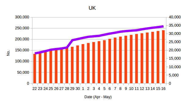
In the following 2 graphs (first for the UK, second for France) the bars show the number of cases of the virus – against the scale on the left – and the lines show the number of deaths from it (scale on the right):
No international comparisons ?

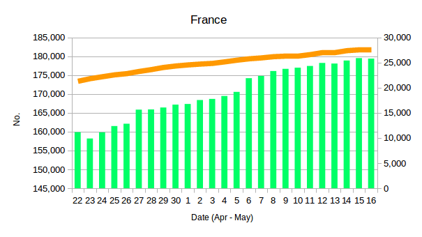
In the following 2 graphs (first for the UK, second for France) the bars show the number of cases of the virus – against the scale on the left – and the lines show the number of deaths from it (scale on the right):
No international comparisons ?
